Blog, Holga, review, Tips

Holga HL-N first outing

So some of you may remember me mentioning in a previous post that Holga had finally brought out both Nikon and Canon mount versions of their lens. I ordered mine from HolgaDirect as soon as I heard the news, and 10 days later it arrived in the post.

Made of cheap plastic, it looks like it has been fashioned from an old detergent bottle top, but then that’s the charm of the Holga line up and similar Toy camera systems. Once attached to the camera body (rather loosely), operating this lens is quite simple. Depending on your camera you will either have to switch to manual ( as I have to) or if you’re lucky Aperture Priority, which will allow you to use the cameras light meter. Usually the light meter will only work if you’re using either a Canon model or pro spec Nikon bodies. On my camera however the light meter will not work, meaning that I have to sort everything out by taking a couple of test shots and checking the histogram. You could also use a hand held light-meter. Doing a little research on various Holga sites I found that the shutter speed on their film cameras is set to about 1/100th sec with a number of folks using iso 400 film, so I thought that this would be a good place to start, and indeed it was. This is based on taking shots during a normal bright day. At this point it is also a good idea to familiarize yourself with the Sunny 16 rule. Focus is achieved by rotating the lens, which has a range of roughly 3ft to infinity with four symbols depicting various distances in-between.

One thing that differs using a Holga lens on an SLR is that you are actually looking through the lens (an obvious point I know), but this isn’t the case on a traditional Holga as it has a viewfinder separate to the lens, like your old point and shoot. The lens is supposedly a fixed F8 meaning that it is very dark when you’re looking through the viewfinder and can be a bit of a challenge, especially in lower light. I just see this as even more a part of the fun of using this lens.

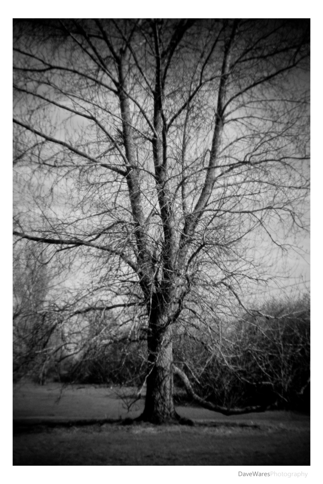
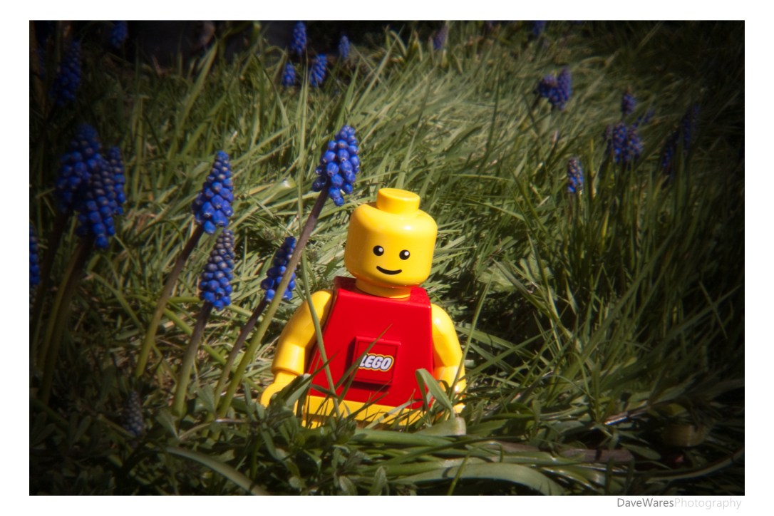
As of yet I have not had a proper chance to get out and about with it, but I did manage to grab a few minutes during my lunch break to take some test shots to give you a flavour of what this lens produces. As you can see, the traditional Holga trademark look is still there, the only thing you wont get is the light leaks produced by the cheap construction of their film cameras.

All in all this lens is a great compromise for those not wanting to go down the film route, and if soft and heavily vignetted photographs is something that appeals to you then there really is no reason not to get one. It costs around $30US with P&P making this about £18.50ish in my money. Bargain!
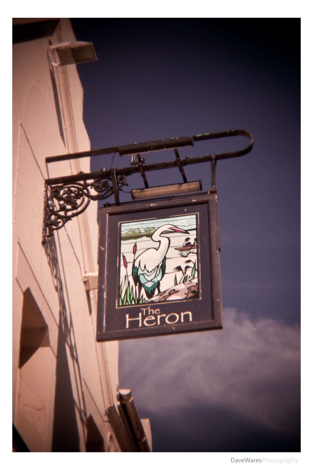
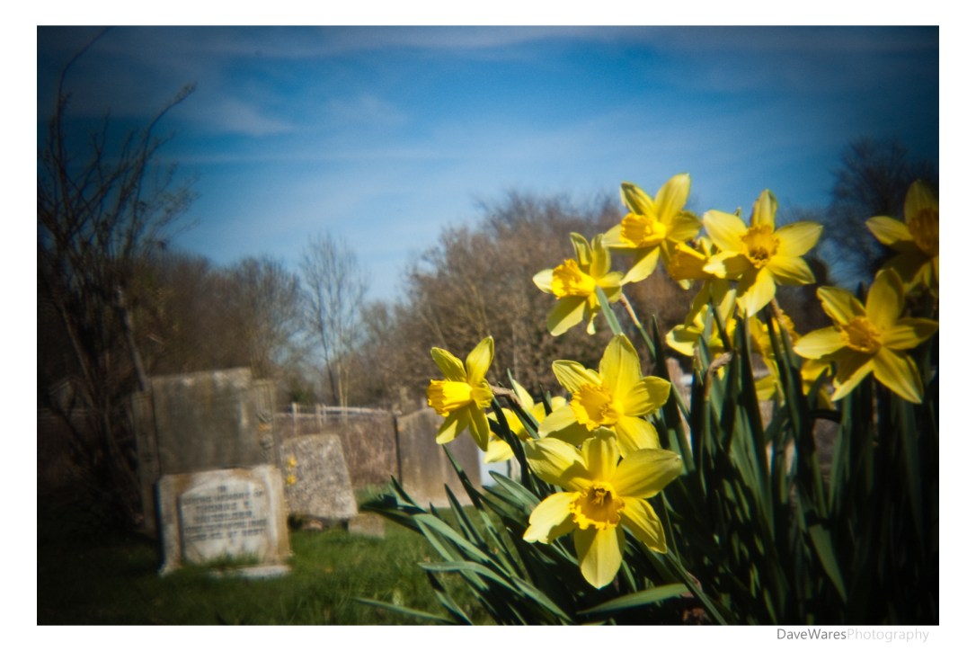
Happy Shooting.

Blog, Events, Mono, Tips

Does it Offend You Yeah @ Coalition Brighton

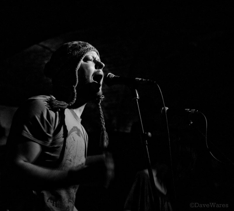
Due to a stroke of luck my wife and I were invited along to see Does it Offend You Yeah at the Brighton Coalition venue this past Sunday. Bass player Chloe (pictured below), used our son for some of their own pictures that are being used on their upcoming CD and asked if we would like to come along and see them in action. We of course jumped at the chance and a chance to use my camera immediately sprung to mind.

Shooting using only the stage lighting was going to be a challenge as essentially I would have to be constantly rearranging my composition and pressing the shutter when the lights were up. As you can imagine this was very hit and miss as a fair number of times I would trip the shutter just as the lighting dropped. There was a fair amount of strobe lighting in their set too which sent my autofocus up the wall.

After doing a bunch of shots of the two support bands (I’ll show in another post) I decided the best srtategy was to set the camera to Manual at ISO800 1/60thsec at f2.8, I found that this seemed to give a good balance between exposure and keeping motion blur to a minimum. Pretty much all the shots I did that evening were on this setting, allowing me to concentrate on capturing the moment.

Shooting with a higher ISO meant I would get a fair amount of noise and with this in mind I knew black and white was a good way to go to use the noise to my advantage; I’ve always had a soft spot for grainy back and white photos. 🙂

Just a hint of colour in the shot of frontman James (above) using the Coldtone preset in Lightroom to accentuate the mood of the moment captured.

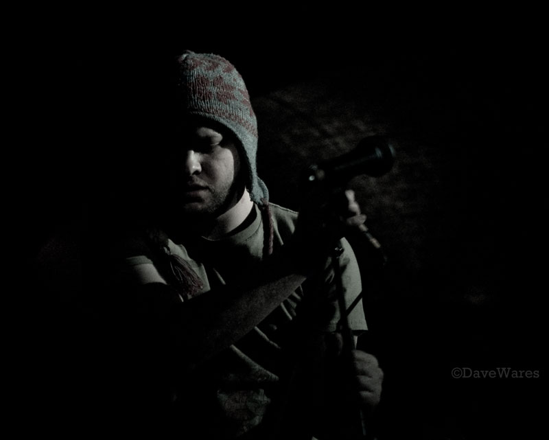
These are just a few of my favourites from the evening, hope you enjoyed them. Just a couple more below with one being colour for good measure.

Thanks for viewing. 🙂

Blog, Tips

Adding a texture

Why not add an extra dimension to your photographs by adding a texture. From giving your photographs the appearance of being printed on different types of papers or materials, to using surfaces such as rust, wood or peeled paint to add a new creative look and feel, adding textures is a heck of a lot of fun and creates endless possibilities for your photographs .

Adding textures is really quite a simple process, all you need is a basic understanding of using layers in Photoshop. The real trick is knowing what images to use and also what kinds of textures will work with them. There is no right or wrong, but you will know whether a picture works or not. It’s just down to trial and error.
The first thing to do is get yourself a few textures together. Get out and take pictures of all manor of things – tree bark, brick, wood flooring, peeling paint – all these and more can make interesting backdrops for your pictures. In addition to making your own texture library there are many other places offering ready made textures, which are great if you want to get stuck in as soon as possible…However, there are a couple of things to remember if using other peoples work. Firstly, I personally feel that there is a greater satisfaction if all the work that goes into creating your picture is your own. Secondly, make sure you look at the licensing terms of any third party images you want to use. Ideally you’ll want these to be Public domain should you wish to sell your work later down the line. I see a lot of folks offering textures under Creative Commons licenses and this is where you may want to really consider whether or not you want to use said images. The vast majority of creative commons works include the ‘non-commercial’ part, meaning that if you wish to sell your images you’ll need to get permission from the creator of the the texture first. To be honest this is an extra hassle that I can do without. If, however, you’re doing it for your own personal pleasure then go ahead and use whatever you think will work best for you.

Once you have your images the next thing is to combine them. Open both images into Photoshop and either use the move tool to drag the texture photo onto your main photo or simply copy the texture image and paste it onto your main image. You should see each image as a separate layers in the layers pallet. Making sure the texture is the top layer, change the blend mode to either multiply or overlay, whichever you like the look of best. After that you can muck about with opacity, rub bits out using the eraser tool, or pretty much do whatever you like.

For the images above and below I used the same texture image, (a shot of a dirty old window) which gives these images a more vintage feel, plus the uneven putty made for a good border too.

For the image above I used the same texture as the first two for the border and then added a second texture (peeling paint) to use over the paperwork.

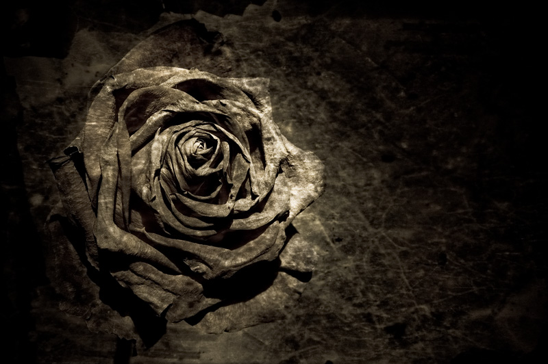
For this image I used another dirty window covered with cobwebs, only this time I overlayed it twice and in different rotations to create a backdrop for the rose. I then used the eraser tool to rub through where the rose was.

It’s not very often that I do these kinds of images but they are a lot of fun and can make pleasing works of photo-art.

If you have any other suggestions and tips then feel free to leave a comment for others to see.

Blog, HDR, Tips

Why HDR?

So I’m not the first to show the benefits of using HDR but I thought I’d do a short post on it anyway. 🙂

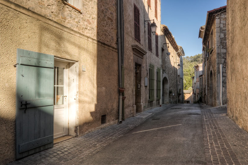
While going through some photos of our holiday to the south of France last summer, I stumbled upon a set of brackets that I hadn’t done anything with, that of an empty street in Provence (above). Now I’ll admit there’s nothing that special about the shot, but there was enough I liked for me to press the shutter. I think it was the beautiful weather and peacefulness that I found pleasing. Whatever my motivation, it shows the usefulness of bracketing your photographs to make an HDR image that  represents a scene more accurately than a single shot can.

These three shots show the different exposures needed to capture all of the elements within the scene. The one on the left is the cameras recommended exposure, the middle is -2EV and is needed to retain detail in the white door which had blown out in the left example, finally the right shot was +2EV and was needed to  capture the areas in shadow. Now to my eye, the areas in shadow on the overexposed image are pretty much as I saw them on the day, so as you can see, due to the huge contrast that my eye compensated for but the camera couldn’t, combining the three shots was the best way to achieve a photo with the tonal range more accurately reproduced.  (Whether you use an HDR program to combine your shots or merge them by hand in a program like Photoshop is up to you). Once I have the tonal range sorted I can then continue to work on an image, giving it the look and feel I have in mind, if I so wish.

The main image was produced using Photomatix Pro with final adjustments done in Lightroom. There are plenty of other HDR software programs out there but it’s up to you to give them a try to see which you prefer, I always seem to come back to Photomatix.

I hope this has been of some use. Like I said, it’s a post to show the benefits of HDR rather than being a tutorial.

Thanks for looking.

Blog, Tips, Urbex

My old style grunge look

(By adding a mono layer to your image you can give your shot a whole new look)

Over the past year I have become know in photography circles for being something of a HDR chap, and for the most part the bulk of my work during 2010 was indeed processed using HDR software. It hasn’t always been that way, in fact I didn’t have any HDR software until January of 2010…Since then I’ve caught the bug and haven’t regretted it one bit. Prior to 2010 I used a different method of giving my Urban exploration work that ‘grunge’ look by blending both colour and mono layers together in Photoshop.

There can be a lot of fiddling about with getting the tones and levels right but the basic idea is this: Open your picture into Photoshop (I’m using Elements) and duplicate the layer, then set the blend mode on the new layer to ‘Screen’, this will lighten the photo. Then right click on that layer and select ‘Merge layer’, you will be back to one layer. Duplicate this layer and convert the new layer to mono using your preferred method. If you use the ‘Convert to Back and white’ tool you will see a range of presets that give different mono looks, such as infra-red, landscape, portrait etc Play around with these and see how the colours react (though you will be seeing black and white). e.g For the picture above I chose to use the infra-red as it darkened the blues and brightened the green areas. Now you have both a colour and mono layer in the layers pallet. With the mono layer still selected, change the blend mono to ‘Multiply’. What you should now see is a much more contrasty and dirty looking picture and if you’re happy with the way it looks then flatten the layers and save. I find that for the most part additional adjustments are required but these vary from picture to picture, usually I’ll change the opacity of the mono layer or use adjustment layers to change the brightness and contrast for each layer. Sometimes I will flatten the layers and use the highlight/shadow tool to balance the image.

As you can see it is not an exact science, but with a little Photoshop know-how you can give your shots that dirty grungy look that some derelict places seem to benefit from, at least in my opinion.

Here is a shot I did a couple of years back using the same method.

Blog, HDR, Tips, Urbex

In the undergrowth

Sometimes it takes a little while to decide on how to process an image, if at all, and this is one of them. The car itself was almost all obscured by trees and twigs but there was enough showing at the front to make an interesting picture. I like the way nature has enveloped it, as if to hide it from view as it slowly decays.

I had an idea that I wanted to remove the colour from the scene to help enhance the sombre feel. Sepia toning was my first thought but something didn’t sit right when I applied it. Then I had an idea…A while back I had put an exposure through Photomatix to try and enhance the grunge within the scene, this was then exported back into Lightroom and I started to play with the different presets the you can use to give your pictures certain appearances. And what a difference these effects have on your photos after being tonemapped. I found that the one that really stood out was the ageing preset, though initially blowing the highlights and giving a bleached out look, this could be easily brought back playing with the exposure and brightness sliders. It was a revolution in how I was to go about working on some of my images, especially my dereliction shots.

So this was to be the approach I used for this shot, and it worked a treat. I was still unhappy with the slight sepia colouration that the preset gave, so I changed the colour temperature sliders until I settled on this very subtle blue tone. With some additional dodging and burning and a slight vignette I eventually ended up with a shot that satisfied the initial feel that I had in mind.

So have a play with those presets, not as a one click solution, but as a bases to take your shots in a different direction. Remember, photographers have been working on and changing how they present their work for years and years, well before the digital age. I was listening to a recent podcast from Chris Marquardt interviewing a chap by the name of George Smyth who develops his pictures using a process called Bromoil . It was very interesting indeed and although this is very different from my working digitally, the ethos is very much the same. I highly recommend checking the podcast out.